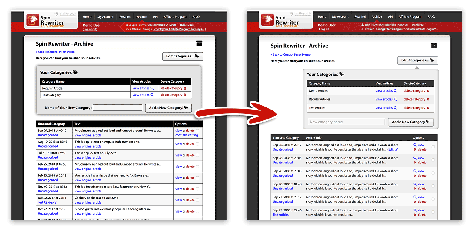
We’ve just rolled out an improved design of the Archive page that makes it easier to keep track of all your spun articles.
The new and improved design lets you see more of your article before you even click it, lets you edit the article title in-place, and brings welcome changes and new icons to the control column of the article list.
The list itself has been cleaned up and no longer comes with visible black borders, and the Categories section now hints at the button it belongs to.
This design update required a number of other changes that were all carefully considered to ensure we improve the user experience for all of our awesome customers. Enjoy! 😀
